Building A Microstartup: A Published Project In A Month

As you might know already, I am not a huge fan of the traditional startup unicorn scene. In my opinion, the goal of startups nowadays is to develop an odd product that seems disruptive just because it’s weird, generate hype, accumulate an adequate user base for the investors, and then do an exit. That’s so wrong for a series of reasons that I discuss on another post.

That’s why I chose the micropreneur lifestyle and decided to build real, useful products instead of hype, and customers instead of myriads of users to show to a VC or business angel.
However, I believe that most of the concepts behind the startup approach are still valid, so together with a friend of mine, I decided to conduct a small experiment and build a microstartup.
The Microstartup Idea
It all started in a casual conversation with Paco, a friend of mine. He has a software development company in my hometown, Cartagena, and he was visiting me at Madrid with his wife and his lovely daughter.
We started to talk about her daughter and how learning to read might be difficult for some children. We then had the idea of developing an application that will teach children to read by reading aloud. The kid will read a word and the app will recognize whether the characters and the pronunciation were correct.
We did some quick research and couldn’t find such an app in Spanish.
After they left I decided to do some further research and I discovered that, indeed, there was not such an app in the App Store in Spanish. A search in Google showed no relevant results either. Furthermore, there was almost no competition for the main keywords in Spanish.
However, the Google keyword planner showed a clear interest in those keywords… That was definitely worth researching.
I did more serious market research and wrote a document with all my findings. In summary, it looked like a profitable, interesting idea we could turn into a viable product.
I talked to Paco about it, and after an inspiring discussion, we decided that we would try to build a microstartup and develop the product.
The Rules of a Microstartup
Our rules were simple:
- The project should target a valid, promising market (potential customers actively searching for a solution to a problem, little to no competition).
- The project should be simple enough to have the first published version within a month.
- Costs need to be minimized. Ideally, less than 100€ should be spent before publishing the first version.
- The project should be profitable right from the start. Its goal has to be generating customers and revenue from minute zero. No investment, no bullshit.
- After a quick release, all the efforts should be pointed towards acquiring customers -customers, not users- and get feedback from them to quickly improve the app.
The Design of the App
With the idea of having the app out as soon as possible, we decided that the design will be really simple. We would present the user a series of illustrations, and a word, and then use natural language processing to detect if the kid read it correctly.
Also, we decided to start with 100 words. The number seemed high enough to make the app interesting for a long period of time while being affordable.
Working in a completely remote way, we made a quick screen flow for the app and, after some tweaking, settled on a simple UI/UX with 4 screens.
Then, Paco asked one of his friends, who is a pedagogue, to give us 100 words appropriate for a 5 to 7 years old child to learn.
Next, with those 100 words, we hired a designer at Upwork to design 100 illustrations. We specified that we were after a childish, naive look for the illustrations.

I have to say I was quite surprised to find an awesome, affordable designer in Europe. Olga did a beautiful work giving us 100 amazing illustrations for roughly $150.
Developing The App
While the designer was doing the illustrations, we started working on the applications.
Paco is a very proficient Android developer, and my main area of expertise is iOS development, so we had a perfect team for developing a native app quickly.
One of the main challenges was the natural language recognition, and making sure the App will do a good job expecting a correct answer from the child while taking into account a certain margin of incorrect pronunciation, accents, etc…
Thus, we spent quite a good amount of time polishing the recognition and tweaking the application. However, being both of us developers, that was probably the easiest part.
Our First Beta and Initial Tests
Developing the app took roughly 10 days. Once we had the first version ready, we tested it ourselves and handed it to some kids to see their reactions and how they interacted with the app.
The results were fairly positive. We identified and fixes some more problems, like the legibility of the font. We then proceeded to publish it both on the iTunes and Google Play stores.
Setting Up a Website for the App
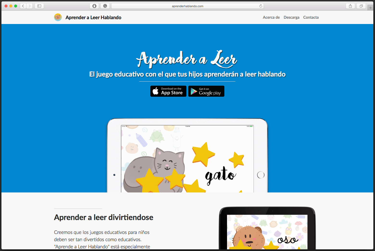
Before uploading a children’s app to iTunes Store, we needed to have a website with the privacy policy (an Apple thing, don’t ask). Thus, while we were adding the final touches and uploading the app, we built the website.

We chose a free Bootstrap template and tweaked it a little to convey an innocent, naive visual language.
The website needed to be as simple and straightforward as the app itself. Two action buttons to download the app from the stores, and some small details for parents.
Also, we wanted to add some video to the website to make it more visually appealing and help explain how the app works to the parents. I have some experience working with video in Motion 5, so I quickly put together a video.
I purposely went for a short, 6 seconds video, that will run only when it’s visible. This will ensure that a visitor will probably watch the video, and also get it ready to use it as a bumper ad later.
Additionally, another important factor was the SEO of the page. We designed the website to focus on all the keywords we found during our initial research.
The Small Launch
We did our small launch some days ago. We didn’t go for a big launch with fancy announcements, press and whatnot. As Paul Graham states in its brilliant article Do Things That Don’t Scale, big launches don’t make a difference:
It’s easy to see how little launches matter. Think of some successful startups. How many of their launches do you remember? All you need from a launch is some initial core of users. How well you’re doing a few months later will depend more on how happy you made those users than how many there were of them.
We had that clear from the very beginning. We just launched and started working on the next step, promoting the app, getting results, and acquiring happy, satisfied customers.
Promoting the Apps
Now that we have launched, it’s time to take care of the advertisement and start promoting the apps.
We have decided to go for a dual campaign in Google Adwords and Facebook Ads.
Of course, at first, we will be measuring a lot the effectiveness of those campaigns, adjusting the keywords and market segmentation, testing, and tweaking.
A week has passed and I am proud to say that we have already generated our first bunch of sales. Nothing really important yet, but I have worked for years on projects and startups that never generated a single euro.
Furthermore, the video I generated for the website was below 6 seconds. That made it a perfect candidate for a bumper ad. A bumper ad is a short advertisement video that runs for 6 seconds or less.
As a result, it’s ideal to be placed in a YouTube video. Indeed, bumper ads are not skippable on YouTube. Thus, we plan on adding that promotion channel too.
The Future
I will keep on updating this post as new, relevant information comes in. I think this project will really take off, as it’s promising, and has somehow managed to get me excited about startups again.
However, if it fails, it would only have cost us $150 and some weeks of work. I think it’s worth trying.


Comments ()